That being said, I've pretty much exhausted every single photo editing app in hopes of finding a suitable mobile replacement for photoshop/lightroom. I'd often find one really good app, but it would only specialize in one area, say, filters. Or I'd find another super great app but I had to pay like 1298310923819 dollars to unlock all of its features. I literally ended up with like 12 photo apps and had to somehow weave my way through all of them to get ONE picture edited. It was terrible. Thankfully, I stumbled upon THE BEST photography app, and I am 100% convinced that this will be the only holy grail I will find in my entire life. AfterLight (formerly known as AfterGlow) is the only app I have on my homescreen that isn't in a folder. I'm not even kidding. I use it THAT much.
So before I show you guys how I edit my pictures, let me emphasize upon the best parts of this app.
1. The ability to turn a not square picture into a square picture.
Well we all know that it' was once super hip to post square pictures, but now it's basically super hip to post NOT square pictures. Well fear not hipsters, AfterLight can make your not square pictures fit into instagram's binding square size. This handy feature can be found in the frames section of the app.
2. All the filters
All I'm saying is that instagram's filters got nothing on this. And for you enthusiasts, you can double filter. Amazing. I know. There are literally 3 different sections that sort something like 55 different filters into these convenient things. MAKE USE OF IT.
3. Slew of cropping ratios
This one is super helpful if you know what you're doing. 16:9 ratio is the typical iPhone 5 screen size, so use this whenever you want to crop a photo to make it into your background (4:3 is the size for iPhone 4S and below. I don't know what iPad's size is. I'm sorry). My favorite part of this whole thing is that you can crop a landscape picture into a portrait picture and vice versa. I don't know if anyone else has run into this problem but seriously this thing got your back.
4. Light Leaks
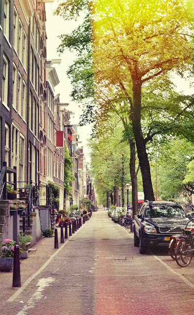
This is probably the killer part of the app. It has a BUTTLOAD of both light leaks and dusty textures to give "depth" and "layers" to a picture. I used it on the before/after AfterLight picture above. I don't even know how to describe this except knock yourself out. Don't hurt anybody in the process please. I'm too lazy to put a tutorial of this. PLs forgive me it'll come soon. Imma talk about it below though too so keep your eyes open.
SO now that you know what all I like using, here's a basic rundown of how I do things!
I begin by usually cropping a picture and straightening it because I seriously cannot take composed pictures on the first try for my life #syntheticcompositionftw. Below you can see me straightening and cropping my picture (I turned the autorotate to tall feature off on my camera, so I end up manually rotating all my portrait pictures. I did it in an in between step cause it's kinda irrelevant). I am seriously in love with the golden ratio crop. There are very few ratios I appreciate in life. The golden ratio is one of the ones I do.
I usually do minor adjustments to exposure, contrast, highlights/shadows, etc. now, after doing all the cropping and "transformations," if you wanna get technical. I didn't do much adjusting to this particular picture except clarify it by a factor of 29. I want to say this is pretty much the same thing as sharpening the picture, but on a far more minor scale that doesn't produce the sometimes unwanted noisy/grainy effect on pictures. I knew my hand shook while I took this picture so this is just going to make the lines more defined for later aesthetic purposes. After I finished clarifying, I added my filter*. Note that I said filter. I don't really double filter; it ain't my cup of tea. But it took me a while to find the "perfect" filter. It's terrible when there are so many options. I finally did happen to settle on Crown.
*I need to mention that most of these filters are achievable by utilizing the adjustment panel properly. Basically filters are "presets" of good looking sets of adjustments. You may want to keep this in mind if you rely heavily on the adjustments portion of editing-some of your work might get negated by the filters!
We're getting to the home stretch. I promise it doesn't actually take as long as it seems. I'm just explaining why I do every thing so nothing seems out of place! I originally didn't plan on putting a light leak on this picture, but there was something about this one that I found so pleasing to the "parallelism" idea that has been drilled into my head after numerous hours of SAT practice and just the english student in me in general. I adjusted the light leak to a different color, the yellow fitting best with the greenish hues of the picture. Finally, of course, I put it into the handy dandy picture-to-square frame so if I wanted to post this on instagram, I could.
Wow that was long. I really hope you learned something from this massive brick+pictures wall of text and maybe I'll be a bit more thorough next time. Who knows. HAHA bye guys!
Love,
Rishita


